Choosing paint colors isn’t just about what looks good on a swatch. It’s a psychological and sensory experience that can transform how a room feels and functions. The science of color reveals that hues have the power to calm, energize, inspire, or focus. By understanding how different shades interact with space, light, and emotion, homeowners can make informed decisions that enhance every room in the home. Here’s how to choose colors for a room with intention and confidence.
Understanding the Basics of Color Psychology
Every color evokes a different emotional response. Warm colors like reds, oranges, and yellows tend to feel stimulating and vibrant. Cool tones such as blues, greens, and purples are typically calming and refreshing. Neutrals—grays, whites, and beiges—offer versatility and subtlety. When planning paint schemes, start by asking what you want to feel in the room. Color psychology can help guide your decisions and ensure each space supports its intended purpose.
How Natural Light Influences Paint Choices
Light exposure dramatically changes how paint looks on the wall. South-facing rooms tend to receive warm, steady sunlight, making colors appear more intense. North-facing rooms have cooler, dimmer light that may mute or blue-tint paint. East-facing rooms catch warm morning light, while west-facing rooms glow in the late afternoon. Testing paint swatches at different times of day is essential to avoid surprises. Observing how natural light behaves in each room will help you choose tones that remain appealing all day long.
Creating a Cohesive Color Flow
While each room can have its own personality, a home should feel unified. One way to achieve this is by choosing a consistent base palette that flows throughout the space. Select a neutral tone or muted hue that recurs in various forms, and then layer accent colors to distinguish individual rooms. Hallways and transitional spaces should bridge the gap between bold choices in adjacent areas. A well-thought-out flow ensures that moving from room to room feels intentional and harmonious.
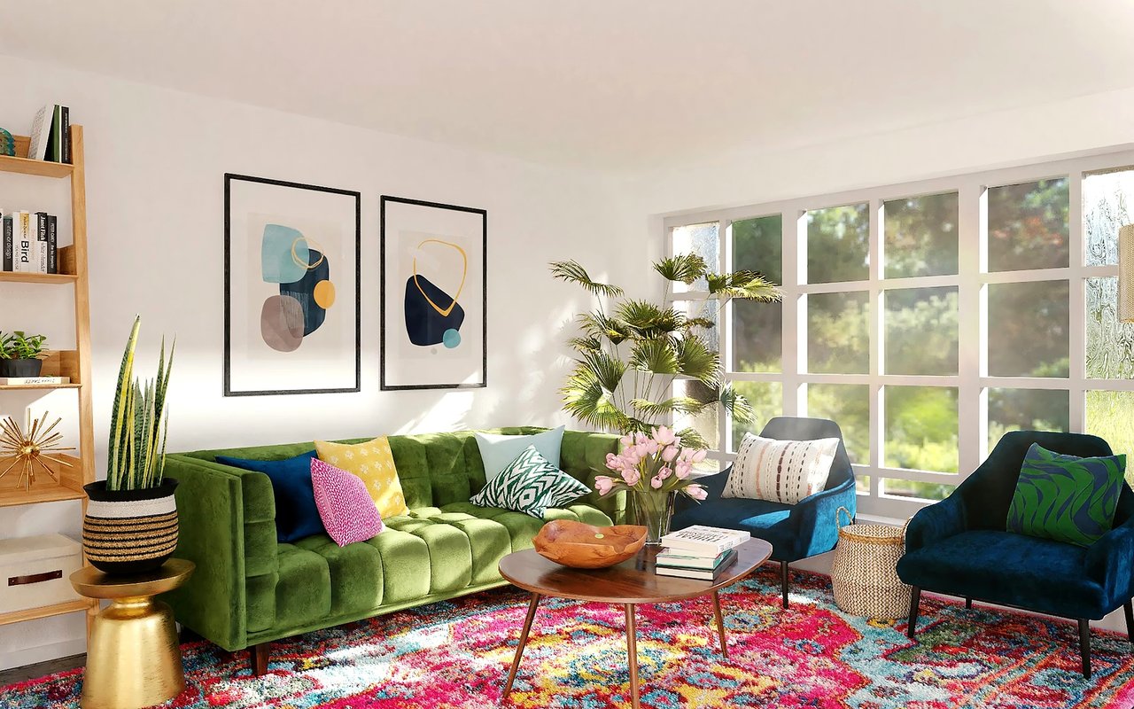
Living Room: Warmth and Invitation
The living room often serves as a social hub, so warmth and comfort are key. Earth tones, such as soft terracotta, taupe, or warm grays, promote relaxation while still offering a refined backdrop. Blues and greens can also work well here if paired with natural textures and warm accents. Choose tones that make the space feel grounded and welcoming, encouraging both conversation and relaxation without overwhelming the senses.
Kitchen: Energy and Cleanliness
In kitchens, color can play a functional role. Lighter shades such as crisp whites, pale grays, or gentle yellows convey cleanliness and brightness, enhancing visibility and freshness. For more personality, consider accent walls or cabinets in rich blues or forest greens. These choices pair well with wood tones and metallic finishes, balancing energy and sophistication. Choosing colors that feel clean and energizing makes the kitchen both a functional and enjoyable space.
Bedroom: Calm and Comfort
Bedrooms benefit most from cool, restful hues. Pale blues, soft greens, lavender, and even muted pinks encourage relaxation and deeper sleep. Avoid overly saturated tones that may be too stimulating at bedtime. Neutral colors like greige, soft beige, or smoky gray also work beautifully, especially when paired with plush textiles and warm lighting. The goal is to create a personal retreat that soothes both the body and mind.
Bathroom: Spa-Inspired Serenity
Bathrooms are often small but powerful spaces for self-care. Light, airy tones like seafoam green, powder blue, or soft cream open up the room and promote tranquility. If you want something more modern, consider slate gray or deep navy—but balance it with white trim or tile for contrast. Since bathrooms often lack natural light, choosing lighter tones can help the space feel more expansive and serene.
Home Office: Focus and Productivity
Productivity is tied closely to your environment, so color choices in a home office should support focus. Blues are known to improve concentration, while greens can enhance creativity and reduce eye strain. Avoid overly warm or dark tones that may feel distracting or heavy. A subtle sage green, muted navy, or even a soft charcoal can help ground the space and support mental clarity.
Dining Room: Sophistication and Appetite
The dining room is a space for gathering and celebration, and colour can enhance the experience. Deep reds, burgundy, or plum are traditional choices thought to stimulate appetite and conversation. For a more contemporary look, consider charcoal gray or muted navy with metallic or wood accents. These tones create an atmosphere of elegance and intimacy, perfect for both formal dinners and casual meals.
Accent Walls and Focal Points
If you're hesitant to commit to a bold color throughout a room, consider creating an accent wall. This allows you to introduce deeper or brighter tones without overwhelming the space. Accent walls work well behind headboards, fireplaces, or in dining areas where you want to draw the eye. Choosing a standout shade in one area can also highlight architectural features or create a sense of depth.
Finish Matters: Matte vs. Satin vs. Gloss
The paint finish you choose affects how the color reads and performs. Matte finishes absorb light and offer a soft, modern look but may be harder to clean. Satin and eggshell finishes are more durable and offer slight sheen—great for high-traffic areas like hallways or kitchens. Glossy finishes reflect light and can make colors pop, though they highlight imperfections. Consider where the paint is going and how much wear it will endure before selecting a finish.
Testing Before Committing
Never rely solely on a paint chip. Always test samples on your actual walls and observe them throughout the day under various lighting conditions. Paint a large enough swatch to see the color's full impact and place it near furniture or finishes you plan to keep. This step saves time, money, and disappointment by ensuring your final choice looks exactly how you imagined.
Bringing Color Into Your Home with Confidence
Choosing the right paint tones for your home doesn’t require a design degree—just a little insight and experimentation. By understanding the science of color and how it interacts with light, space, and mood, you can make informed choices that bring each room to life. Whether you're creating a restful bedroom or an energetic kitchen, colour has the power to elevate your space and reflect your personal style.
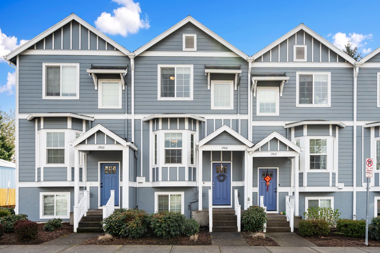
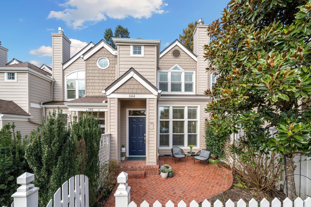
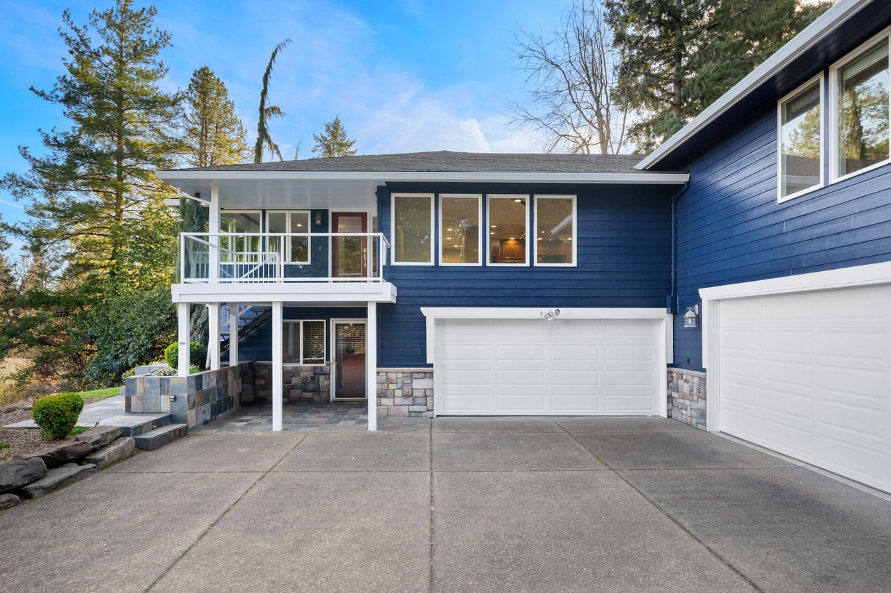
Partner with Monaghan Real Estate Group for Inspired Living
Creating a home you love starts with choosing the right space—and the right team to guide you.
Monaghan Real Estate Group brings extensive local knowledge and a passion for inspired living to every real estate journey. Their team helps clients find homes that offer both style and substance, where every wall becomes a canvas for self-expression. Connect today to explore available listings and begin your home transformation today.
Recommended reading: 8 Condo Upgrade Ideas